Greeks & IV Tab Explanation
Greeks & IV Explained
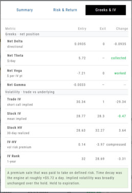
The Greeks & IV tab helps you understand why an options trade performed the way it did.
Instead of showing Greeks only when you enter a trade, the Journal compares them at Entry and Exit. Think of it as a before-and-after view of your trade.
Net Delta — Direction
Delta shows how sensitive your position was to movement in the underlying stock.
- Positive Delta benefits from an upward move.
- Negative Delta benefits from a downward move.
- A move toward zero generally means directional exposure decreased.
Comparing Entry to Exit helps show whether stock movement became more or less important as the trade progressed.
Net Theta — Time Decay
Theta estimates how much the position gains or loses from the passage of time each day.
- Premium-selling strategies generally benefit from positive Theta.
- Premium-buying strategies generally pay Theta as time passes.
Rather than showing only how the daily Theta rate changed, the Journal identifies whether time decay was collected or paid during the trade.
Net Vega — Implied Volatility
Vega measures how changes in implied volatility affected the position.
- Long options generally benefit when IV rises.
- Short-premium positions generally benefit when IV falls.
The Journal summarizes whether volatility:
- Worked in your favor
- Hurt the trade
- Faded as the position approached expiration or lost remaining premium
Net Gamma — Delta Sensitivity
Gamma measures how quickly Delta can change as the underlying moves.
Higher Gamma means your directional exposure can change more quickly, particularly as expiration approaches.
For most trade reviews, Gamma provides additional context about how sensitive the position became to price movement.
Understanding Volatility
Trade IV
Trade IV is the implied volatility associated with the option contracts in your trade.
It reflects the volatility being priced into the specific strikes you bought or sold.
Stock IV
Stock IV represents the broader implied volatility of the underlying stock.
Comparing Trade IV with Stock IV can help show whether your specific options were priced with more or less volatility than the stock’s overall option market.
Stock HV
Historical Volatility (HV) measures how much the stock actually moved over the previous 30 days.
Think of it this way:
IV = expected volatility
HV = actual recent volatility
IV − HV
IV − HV compares the volatility the options market was pricing with the volatility the stock actually experienced.
- Positive: IV was higher than HV.
- Negative: HV was higher than IV.
For premium sellers, a positive difference can indicate that options were pricing in more movement than the stock had recently been delivering.
IV Rank
IV Rank shows where the stock’s current implied volatility falls within its own 1-year range, from 0 to 100.
- A higher IV Rank means volatility is relatively high for that stock.
- A lower IV Rank means volatility is relatively low.
This gives IV some context. A 30% IV may be high for one stock and low for another.
Reading the Results
The Change column helps you quickly see what happened between Entry and Exit.
Some rows show a numeric change, while Theta and Vega use words such as collected, paid, worked, hurt, or faded to make the result easier to interpret.
Colors provide another quick reference:
- Green — helped the trade
- Red — hurt the trade
- Gray — neutral or informational
A negative number is not automatically bad. For example, Delta moving closer to zero may be favorable for a short-premium trade.
Putting It All Together
When reviewing the Greeks & IV tab, ask yourself:
Did price movement help or hurt?
Look at Delta.
Did time work for or against me?
Look at Theta.
Did changes in volatility help or hurt?
Look at Vega and Trade IV.
Was volatility relatively high or low when I entered?
Look at IV Rank and IV − HV.
Taken together, these numbers help answer the most important question:
Did the trade work for the reason I expected it to?
26-06 Release- Bid/Ask Percent Data
Bid/Ask Spread – Premium Percentage
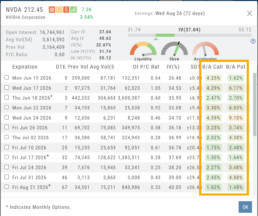
What do these columns represent?
The values represent the Bid/Ask spread percentage for the At-The-Money strike for each Expiration.
The percentage background color ranges from green, gray, yellow, and red, which represents the most liquidity to least for that ATM Expiration
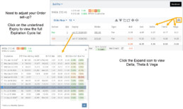
Spread Trade example:
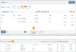
Bull Put
1. The negotiation slider dynamically calculates the percentage of the position premium (debit or credit) that the bid/ask spread comprises when the slider is moved between the Mid (0.00%) and Natural (Max %).
2. This value confirms the Spread value. In this example, the value is 15. The strikes are 200/215:
Multi-Leg Example:
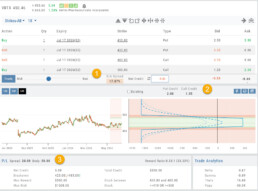
Iron Condor
1. The negotiation slider dynamically calculates the percentage of the position premium (debit or credit) that the bid/ask spread comprises when the slider is moved between the Mid (0.00%) and Natural (Max %).
2. The Put/Call Premium is calculated and tied to the “Bid”.
3. The Outer legs and Body spread values.
Change Log
- ADUR display resolved
- Repaired snap quote issue with Tradier
- SPLG>SPYM display data corrected
26-06 Release Notes: Bid/Ask data
Bid/Ask Spread – Premium Percentage
What do these columns represent?
The values represent the Bid/Ask spread percentage for the At-The-Money strike for each Expiration.
The percentage background color ranges from green, gray, yellow, and red, which represents the most liquidity to least for that ATM Expiration
Change Log
- ADUR display resolved
- Repaired snap quote issue with Tradier
- SPLG>SPYM display issue corrected
Platform Features Release: Trade from the Chart, Price Slices, Reset Virtual Account Options
Announcing the latest Release of feature and functionality enhancements to the trading platform to improve the position evaluation process, trade submitting process as well as offer additional practice account settings:
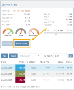
Price Slices: Evaluate theoretical outcomes of option positions when using the Strategy Templates.
Trade from the Chart: Use the control box or lines on Chart to adjust the entry point, Target Price and/or Stop Price.
Reset Virtual Account – Add ‘funds’ to an existing account OR reset everything and start fresh. You decide.
Price Slices (Premium Feature)
The  Button appears on the right side of the screen when using the Strategy Templates.
Select one of the 22 Option Strategy Templates.
Build the position.
Click the Price Slices button to start your evaluation
Change the Date (default ‘today’), Price levels and/or % Offset
Add IV to view how this affects the theoretical P/L
Click the Go Big icon to view additional Greek data
Trade from the Chart
The  button appears at the top of the chart for any symbol – whether there is an existing position or not.
Clicking this button activates an Order Window on the Chart, like this:
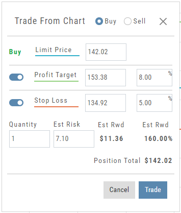
Note: Buy, Profit and Stop Loss line colors will match those displayed on the chart itself.
The values in the Order Window can be manually adjusted by $ or %
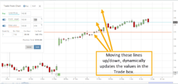
The values can also be dynamically adjusted by moving the corresponding line(s) on the Chart itself.
The Quantity value default is “1” to show the ‘per share’ dollar and percentage estimated risk, reward, as well as Position Total.
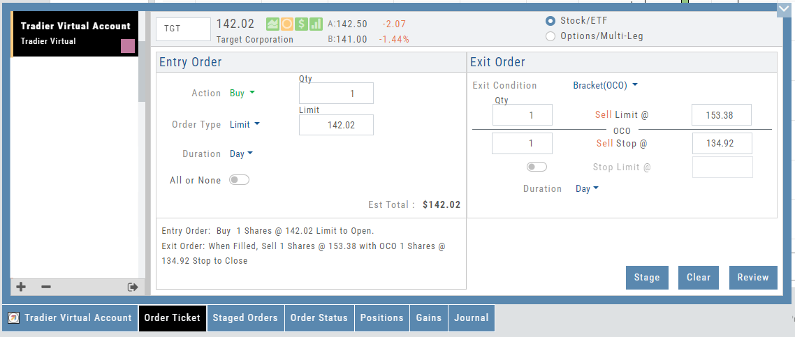
Click “Trade” for the prefilled Order Ticket to display.
The Order Ticket can be further adjusted, Staged or Reviewed to ensure it’s completed to your satisfaction, then Submitted.
Note: The brokerage selected must support Bracket Orders if the Stop/Stop Limit values are selected on the Order Window
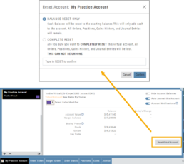
Reset Tradier Virtual Account – 2 options
Tradier’s Virtual Account gives you the ability to add more “Cash” to your practice account – OR – completely start over:
On the account summary page, click “Reset Virtual Account”
Select “Balance Reset Only” – to keep your existing trade activity, but add more “cash” to your virtual account.
Select “Complete Reset” – if you want to remove all prior transactions, including Journal Entries, Gains, Orders, Positions, etc. Note: This selection cannot be undone once it’s processed.
Type RESET in the box provided, then click the “Confirm” button
Enhancements
- ATM Option Strikes are bolded for easier identification
Change Log
- Adjusted theme contrast
- Corrected Order Type Limit price entry
- Snapshot functionality restored
Multiple Position Analysis
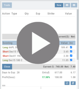
We often have more than one position on a particular Stock/ETF, so how can each position, or leg be evaluated?

Click the Graphic Below for video on the Option Tab P/L Feature to see how to evaluate individual legs or positions on a Stock/ETF
Option Chain Video
Option Chain Functionality
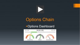
Option Chain Video
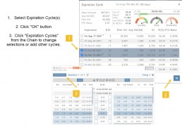
Research>Option Tab, click on “Expiration Cycle” for the “Call+Put”, “Calls” or “Puts” view.
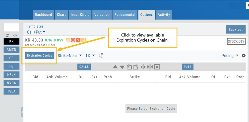
Option Chain Expiration Cycles
The Option Chain Expiration Table gives you control of selecting which Expiration Cycle(s) you want to view.
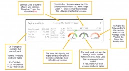
The Option Dashboard provides a wealth of pertinent information to make informed decisions easier.
See below for more detail
Expiration Cycles: All available options will be displayed. Monthly Options are indicated with an asterick
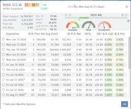
Select Expiration Cycles
Click ‘OK”
Chain will display for selected
Strategy Template
A Strategy Template provides a shortcut to quickly create an option strategy, virtually eliminating structure errors. Once selected, you can modify the structure within the template using the tools on above the option tables: Moving Strikes up/down, rolling Time out/in, widening or narrowing Strikes.

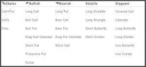
Some strategies can be changed from all Calls to all Puts (and vice-versa).
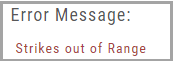
Note: The templates will not allow you to exceed certain parameters, as attempting to do so would result in an invalid strategy. This is a built-in safety net and you would receive a notice similar to:
Options Navigation
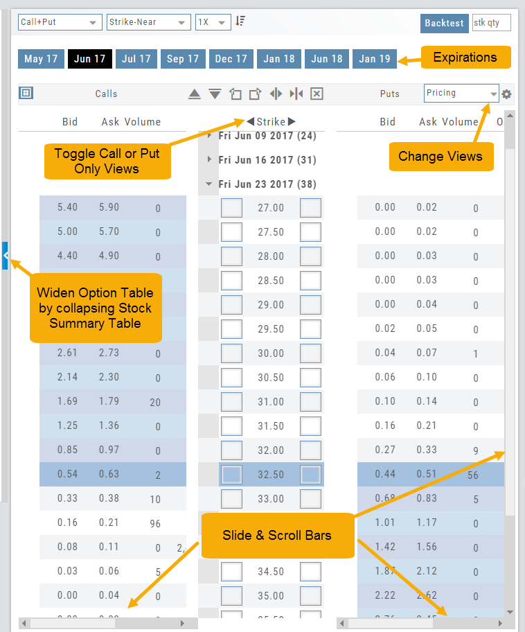
Expirations are displayed above the Option Table.
Select the months to view by clicking on the appropriate box. All available dates are displayed. Remember, the further out the option expiration is, the fewer dates are available.
Toggle between Calls Only or Puts Only view.
Change Option Table views to Pricing, Value, Greeks, Trade or new Custom views you create to suit your needs.
The small tab on the left side of the table will collapse the stock summary box & widen the option table.
The scroll bar on the right side and slide bars at the bottom on the table offer additional navigation.
Research
Narrow the field to find the highest probability trades.
Stock
You’ve narrowed the field by selecting potential candidates matching the outlook and selected strategy, but which of those have the highest probability of success? Research allows you to drill down for information as much or as little as you want.
The Dashboard provides an overview: Quote Detail, The Score, Activity such as News/Earnings/Dividends and information about the Company and a list of other company stock symbols in the same industry. Each component has it’s own tab to provide more detail.
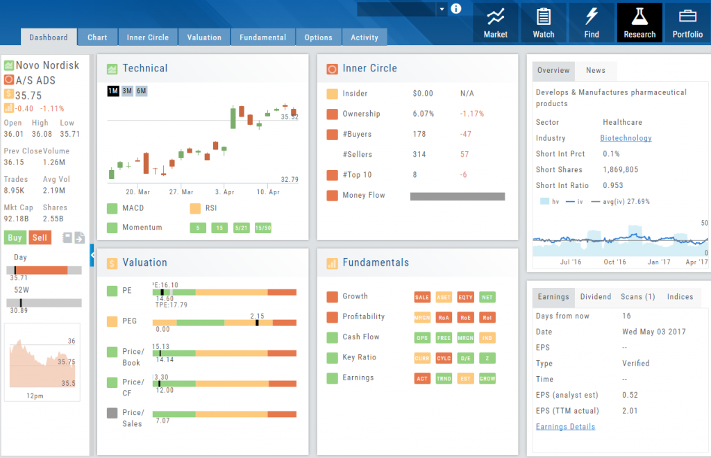
Components of The Score are designed to keep the information available to you, but out of the way when you don’t need it.
The Options Tab offers Strategy templates, option chains, snapshots and definitions of strategies, P/L Graph with Risk/Reward ratio, Analytics and Stock/Volatility charts.
The Activity Tab includes a Beta version of the Journal as well as News and StockTwits ®
Storyboard of the Strategy
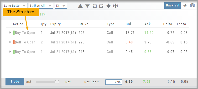
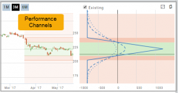
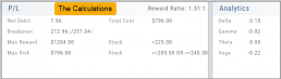
We also display a storyboard-like view of the selected strategy. It is a combination of chart, risk graph, and performance channel constructed within one panel.
This storyboard gives you the full picture of the position: The Structure, Performance Channels and Calculations.