Greeks & IV Tab Explanation
Greeks & IV Explained
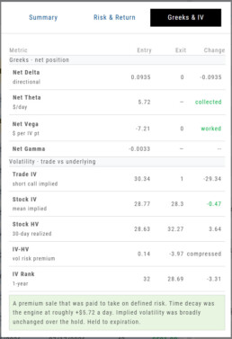
The Greeks & IV tab helps you understand why an options trade performed the way it did.
Instead of showing Greeks only when you enter a trade, the Journal compares them at Entry and Exit. Think of it as a before-and-after view of your trade.
Net Delta — Direction
Delta shows how sensitive your position was to movement in the underlying stock.
- Positive Delta benefits from an upward move.
- Negative Delta benefits from a downward move.
- A move toward zero generally means directional exposure decreased.
Comparing Entry to Exit helps show whether stock movement became more or less important as the trade progressed.
Net Theta — Time Decay
Theta estimates how much the position gains or loses from the passage of time each day.
- Premium-selling strategies generally benefit from positive Theta.
- Premium-buying strategies generally pay Theta as time passes.
Rather than showing only how the daily Theta rate changed, the Journal identifies whether time decay was collected or paid during the trade.
Net Vega — Implied Volatility
Vega measures how changes in implied volatility affected the position.
- Long options generally benefit when IV rises.
- Short-premium positions generally benefit when IV falls.
The Journal summarizes whether volatility:
- Worked in your favor
- Hurt the trade
- Faded as the position approached expiration or lost remaining premium
Net Gamma — Delta Sensitivity
Gamma measures how quickly Delta can change as the underlying moves.
Higher Gamma means your directional exposure can change more quickly, particularly as expiration approaches.
For most trade reviews, Gamma provides additional context about how sensitive the position became to price movement.
Understanding Volatility
Trade IV
Trade IV is the implied volatility associated with the option contracts in your trade.
It reflects the volatility being priced into the specific strikes you bought or sold.
Stock IV
Stock IV represents the broader implied volatility of the underlying stock.
Comparing Trade IV with Stock IV can help show whether your specific options were priced with more or less volatility than the stock’s overall option market.
Stock HV
Historical Volatility (HV) measures how much the stock actually moved over the previous 30 days.
Think of it this way:
IV = expected volatility
HV = actual recent volatility
IV − HV
IV − HV compares the volatility the options market was pricing with the volatility the stock actually experienced.
- Positive: IV was higher than HV.
- Negative: HV was higher than IV.
For premium sellers, a positive difference can indicate that options were pricing in more movement than the stock had recently been delivering.
IV Rank
IV Rank shows where the stock’s current implied volatility falls within its own 1-year range, from 0 to 100.
- A higher IV Rank means volatility is relatively high for that stock.
- A lower IV Rank means volatility is relatively low.
This gives IV some context. A 30% IV may be high for one stock and low for another.
Reading the Results
The Change column helps you quickly see what happened between Entry and Exit.
Some rows show a numeric change, while Theta and Vega use words such as collected, paid, worked, hurt, or faded to make the result easier to interpret.
Colors provide another quick reference:
- Green — helped the trade
- Red — hurt the trade
- Gray — neutral or informational
A negative number is not automatically bad. For example, Delta moving closer to zero may be favorable for a short-premium trade.
Putting It All Together
When reviewing the Greeks & IV tab, ask yourself:
Did price movement help or hurt?
Look at Delta.
Did time work for or against me?
Look at Theta.
Did changes in volatility help or hurt?
Look at Vega and Trade IV.
Was volatility relatively high or low when I entered?
Look at IV Rank and IV − HV.
Taken together, these numbers help answer the most important question:
Did the trade work for the reason I expected it to?
Advanced Analytics
Some strategies are more responsive to time decay and/or volatility than others. This platform has tools to help analyze these components.
- Construct the position in the Option Chain table
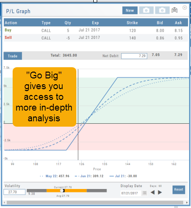
- Select the ‘Go Big’ icon on the P&L Graph
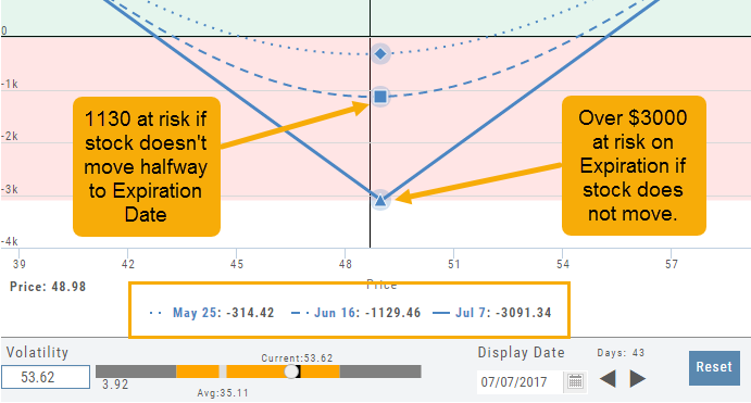
- The Graph shows 3 data points: Current Day, Halfway point to Expiration Day & Expiration Day. The corresponding legend, immediately below the graph, follows the cursor slider along the graph.
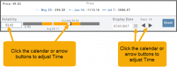
- The bottom of the screen contains a Calendar (Time) & Volatility Scale. Both can be manipulated to analyze the position.
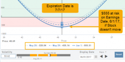
Time: You can select a date to analyze as well as user stepper buttons to move day by day backward or forward.
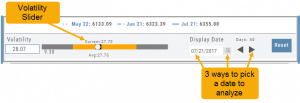
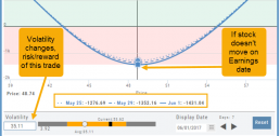
Volatility: Use the volatility slider or enter a value in the entry box to see the impact of changes in volatility. The slider bar also displays the current (circle), average (gray), and 1 year high / low of implied volatility (orange portion of the slider) for easy reference.
Historic & Implied Volatility
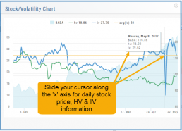
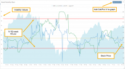
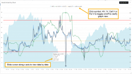
This chart displays Historic (HV) and Implied (IV) Volatility with the ability to overlay Call/Put IV
Historic Volatility (green line) is based on how the stock actually moved.
Implied Volatility (blue line) is based on how the options are priced.
When expanded, the stock chart, 12-Month Mean (Average) IV and one-year IV High/Low (red line) are also shown. This is very helpful in understanding if option premiums are comparable to historic values.
High HV indicates recent strong movement.
High IV indicates higher premium and, in many cases, anticipated movement.
Note: You can remove the Stock Chart, HV, IV or Call/Put IV simply by clicking on the corresponding indicator above the chart/graph.
Go Big - Graphs & Charts
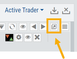
Anywhere you see the ‘Go Big’ icon  , you can expand the graphic and access additional information.
The Chart Tab under Research has such a button in the icon toolbar as shown:
The Heat Map on the Market Tab will allow you to filter criteria such as stock price, volume, market cap, etc. 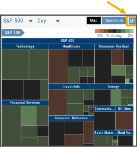
In the Options Tab, you can do this with the P/L Graph and the Volatility Chart. The icon is located at or near the upper right of the graph or chart.
Expanding the Stock/Volatility Chart allows you to view past Historic Volatility, Intrinsic Volatility and stock price on a day-to-day basis.
For deeper Trade Analysis, use the Volatility Slider tool and the Date Picker, located at the bottom of the P&L Graph: